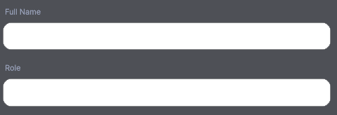
Rounded Input Field
Card-style text input with rounded corners and focus/error colour states.
Contents
1 Overview
4 Events
5 Methods
6 Usage
Overview
RoundedInputField is a text input with rounded corners and a custom placeholder implementation. The placeholder is rendered as an absolutely-positioned Label that is shown or hidden based on whether the current Value is empty. This avoids the style limitations of the built-in Unity TextField placeholder.
Typical use cases:
- Search bars and filter inputs
- Notes or comment text areas
- Inline editing fields within list rows
Properties
| Name | Description | Options |
|---|---|---|
Value |
Gets or sets the current text value. Setting this updates the underlying TextField and fires ValueChanged. |
string |
Placeholder |
Gets or sets the placeholder hint text. Shown when Value is empty and the field is not focused. |
string |
IsPassword |
Gets or sets password masking. | bool |
Multiline |
Gets or sets multiline input mode. | bool |
MaxLength |
Gets or sets the maximum allowed character count. -1 means no limit. |
int |
USS Classes
| Class | Description |
|---|---|
roundedInputField |
Root element. |
roundedInputField__textField |
The TextField element. Apply border-radius here for the rounded shape. |
roundedInputField__input |
Internal input content area inside the TextField. |
roundedInputField__placeholder |
Absolutely-positioned Label that renders the placeholder text. Toggled visible when Value is empty. |
Events
| Name | Description | Arguments |
|---|---|---|
ValueChanged |
Fired when the text value changes. | string newValue |
Methods
| Signature | Description |
|---|---|
SetValueWithoutNotify(string value) |
Sets the field value without firing ValueChanged. Useful for initializing from saved state. |
SetBackgroundColor(Color color) |
Sets the background color of the text field. |
SetTextColor(Color color) |
Sets the input text color. |
SetPlaceholderColor(Color color) |
Sets the color of the placeholder label. |
SetFontSize(float size) |
Sets the font size for both input text and placeholder. |
Focus() |
Programmatically focuses the input. |
Usage
Add the control to your scene using:
GameObject -> UI Toolkit -> Extensions -> Rounded Input Field
This creates a UIDocument in the scene (plus a PanelSettings with the default runtime theme, if the project has none) and assigns an editable starter template with demo content, copied to Assets/UI Toolkit Extensions.
A starter template can also be added to an existing document using:
Assets -> Create -> UI Toolkit -> Extensions -> Rounded Input Field Starter
Alternatively, drag the control into a document from the UI Builder Library (Project -> Custom Controls -> UnityUIToolkit.Extensions) or declare it directly in UXML:
<ui:UXML xmlns:ui="UnityEngine.UIElements" xmlns:ext="UnityUIToolkit.Extensions" editor-extension-mode="False">
    <ext:RoundedInputField placeholder="Type something..." />
</ui:UXML>
The shared extensions stylesheet is applied automatically when the control is created in the Editor and in Play Mode, so no manual stylesheet reference is needed while authoring. The starter templates also reference the stylesheet explicitly, which covers player builds; for hand-written UXML or code-first UI in builds, add the stylesheet to your UXML or panel theme.
Using the Control
Search Bar
using UnityEngine;
using UnityEngine.UIElements;
using UnityUIToolkit.Extensions;

public class ContactSearchController : MonoBehaviour
{
    [SerializeField] private UIDocument _document;

    private RoundedInputField _searchField;

    private void OnEnable()
    {
        var root = _document.rootVisualElement;

        _searchField = new RoundedInputField();
        _searchField.Placeholder = "Search contacts...";
        _searchField.SetPlaceholderColor(new Color(0.5f, 0.5f, 0.5f, 1f));
        _searchField.SetBackgroundColor(new Color(0.15f, 0.15f, 0.2f, 1f));
        _searchField.SetTextColor(Color.white);
        _searchField.SetFontSize(14f);

        _searchField.ValueChanged += OnSearchChanged;

        root.Q<VisualElement>("searchContainer").Add(_searchField);
    }

    private void OnSearchChanged(string query)
    {
        Debug.Log($"Filter contacts by: {query}");
    }
}
Notes Field with Initial Value
_notesField = new RoundedInputField();
_notesField.Multiline = true;
_notesField.MaxLength = 500;
_notesField.Placeholder = "Add a note...";

// Initialize from saved data without triggering a change event
_notesField.SetValueWithoutNotify(savedNotes);

_notesField.ValueChanged += text => _isDirty = true;
Example Scenes
This control is demonstrated in the following package examples:
Credits and Donation
SimonDarksideJ
External links
| UI Toolkit Extensions repository | OpenUPM package |
Demonstrated In
- Registration Form — A complete mobile-style registration flow with input validation and shake feedback on errors.
- Step Wizard — A multi-step wizard flow with a step progress bar and per-step inputs.