Icon Label Button
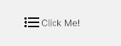
Horizontal row button combining a left-side icon with label and subtitle text.
Contents
1 Overview
4 Events
5 Methods
6 Usage
Overview
IconLabelButton is a full-width row button that pairs a 24 × 24 px icon on the left with a text label. It provides hover and pressed state modifier classes for visual feedback without custom USS.
Typical use cases:
- Menu and navigation row items
- Action list rows (share, delete, report, etc.)
- Settings list entries with a leading icon
Properties
| Name | Description | Options |
|---|---|---|
Text |
Gets or sets the button label text. | string |
USS Classes
| Class | Description |
|---|---|
iconLabelButton |
Root element. Full-width flex row. |
iconLabelButton__button |
Inner button element that wraps icon and label. |
iconLabelButton__icon |
Icon element. Fixed at 24 × 24 px. |
iconLabelButton__label |
Text label element next to the icon. |
iconLabelButton--hover |
Modifier applied on pointer-enter. |
iconLabelButton--pressed |
Modifier applied while pointer is held down. |
Events
| Name | Description | Arguments |
|---|---|---|
Clicked |
Fired when the button is tapped or clicked. | none |
Methods
No public methods beyond property access. Use the Text property and USS to configure the control.
Usage
Add the control to your scene using:
GameObject -> UI Toolkit -> Extensions -> Icon Label Button
This creates a UIDocument in the scene (plus a PanelSettings with the default runtime theme, if the project has none) and assigns an editable starter template with demo content, copied to Assets/UI Toolkit Extensions.
A starter template can also be added to an existing document using:
Assets -> Create -> UI Toolkit -> Extensions -> Icon Label Button Starter
Alternatively, drag the control into a document from the UI Builder Library (Project -> Custom Controls -> UnityUIToolkit.Extensions) or declare it directly in UXML:
<ui:UXML xmlns:ui="UnityEngine.UIElements" xmlns:ext="UnityUIToolkit.Extensions" editor-extension-mode="False">
    <ext:IconLabelButton text="Click Me!" />
</ui:UXML>
The shared extensions stylesheet is applied automatically when the control is created in the Editor and in Play Mode, so no manual stylesheet reference is needed while authoring. The starter templates also reference the stylesheet explicitly, which covers player builds; for hand-written UXML or code-first UI in builds, add the stylesheet to your UXML or panel theme.
Using the Control
Navigation Menu
using UnityEngine;
using UnityEngine.UIElements;
using UnityUIToolkit.Extensions;

public class SideMenuController : MonoBehaviour
{
    [SerializeField] private UIDocument _document;
    [SerializeField] private Texture2D _homeIcon;
    [SerializeField] private Texture2D _profileIcon;
    [SerializeField] private Texture2D _settingsIcon;

    private void OnEnable()
    {
        var root = _document.rootVisualElement;
        var menu = root.Q<VisualElement>("sideMenu");

        menu.Add(CreateMenuRow("Home", _homeIcon, () => NavigateTo("home")));
        menu.Add(CreateMenuRow("Profile", _profileIcon, () => NavigateTo("profile")));
        menu.Add(CreateMenuRow("Settings", _settingsIcon, () => NavigateTo("settings")));
    }

    private IconLabelButton CreateMenuRow(string label, Texture2D icon, System.Action onClicked)
    {
        var btn = new IconLabelButton();
        btn.Text = label;

        // Query by class name (first arg is element name — pass null; second is class name)
        var iconEl = btn.Q(null, IconLabelButton.IconClass);
        if (iconEl != null)
            iconEl.style.backgroundImage = new StyleBackground(icon);

        btn.Clicked += onClicked;
        return btn;
    }

    private void NavigateTo(string screen)
    {
        Debug.Log($"Navigating to: {screen}");
    }
}
USS Customization
Override hover and pressed states in your project USS:
.iconLabelButton--hover {
    background-color: rgba(255, 255, 255, 0.06);
}

.iconLabelButton--pressed {
    background-color: rgba(255, 255, 255, 0.12);
}
Example Scenes
This control is demonstrated in the following package example:
Credits and Donation
SimonDarksideJ
External links
| UI Toolkit Extensions repository | OpenUPM package |
Demonstrated In
- Content Explorer — A full content-browsing screen that composes scroll-snap, collapsible sections, inputs, a loading state and toasts into one layout.