Collapsible Section
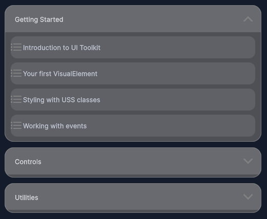
Animated expand/collapse section with header toggle and content container.
Contents
1 Overview
4 Events
5 Methods
6 Usage
Overview
CollapsibleSection is a container with a tappable header that expands or collapses its body content. The body transition is driven by a max-height animation (0 → 2000 px, 250 ms ease-out) triggered by the collapsibleSection--expanded modifier class, so no code-side animation is required for the open/close motion.
Typical use cases:
- FAQ accordion panels
- Collapsible settings groups
- Nested content trees inside scroll containers
- Any section where body content should be hidden by default
Properties
| Name | Description | Options |
|---|---|---|
IsExpanded |
Gets or sets the current expanded state. Setting this value animates the body and fires OnExpandedChanged. |
bool |
TitleText |
Gets or sets the header label text. | string |
USS Classes
| Class | Description |
|---|---|
collapsibleSection |
Root element. |
collapsibleSection__header |
Tappable header row. Contains the title and chevron. |
collapsibleSection__title |
Label element inside the header. |
collapsibleSection__chevron |
Chevron/arrow icon that rotates to indicate state. |
collapsibleSection__body |
Outer body wrapper. Has max-height transition for the open/close animation. |
collapsibleSection__bodyContent |
Inner content container. Receives children added via AddBodyContent. |
collapsibleSection--expanded |
Modifier applied to the root when expanded. Drives the max-height transition and chevron rotation. |
Events
| Name | Description | Arguments |
|---|---|---|
OnExpandedChanged |
Fired after the expanded state changes. | bool isExpanded |
Methods
| Signature | Description |
|---|---|
AddBodyContent(VisualElement element) |
Appends a child element to the inner body content container. |
SetBodyText(string text) : Label |
Convenience method that creates and appends a Label with the given text. Returns the created label. |
Toggle() |
Toggles the expanded state. Equivalent to IsExpanded = !IsExpanded. |
Usage
Add the control to your scene using:
GameObject -> UI Toolkit -> Extensions -> Collapsible Section
This creates a UIDocument in the scene (plus a PanelSettings with the default runtime theme, if the project has none) and assigns an editable starter template with demo content, copied to Assets/UI Toolkit Extensions.
A starter template can also be added to an existing document using:
Assets -> Create -> UI Toolkit -> Extensions -> Collapsible Section Starter
Alternatively, drag the control into a document from the UI Builder Library (Project -> Custom Controls -> UnityUIToolkit.Extensions) or declare it directly in UXML:
<ui:UXML xmlns:ui="UnityEngine.UIElements" xmlns:ext="UnityUIToolkit.Extensions" editor-extension-mode="False">
    <ext:CollapsibleSection title-text="Section Title" body-text="Collapsible body content goes here." />
</ui:UXML>
The shared extensions stylesheet is applied automatically when the control is created in the Editor and in Play Mode, so no manual stylesheet reference is needed while authoring. The starter templates also reference the stylesheet explicitly, which covers player builds; for hand-written UXML or code-first UI in builds, add the stylesheet to your UXML or panel theme.
Using the Control
Basic Setup
using UnityEngine;
using UnityEngine.UIElements;
using UnityUIToolkit.Extensions;

public class FaqController : MonoBehaviour
{
    [SerializeField] private UIDocument _document;

    private void OnEnable()
    {
        var root = _document.rootVisualElement;

        var section = new CollapsibleSection();
        section.TitleText = "What is this app?";

        // Add plain text body
        section.SetBodyText(
            "This app helps you track your daily habits and review progress over time.");

        // Add a richer body element
        var linkLabel = new Label("Learn more at example.com");
        linkLabel.style.color = new StyleColor(new Color(0.35f, 0.65f, 1f));
        section.AddBodyContent(linkLabel);

        section.OnExpandedChanged += isExpanded =>
        {
            Debug.Log($"Section is now {(isExpanded ? "open" : "closed")}");
        };

        root.Add(section);
    }
}
Programmatic Expand / Collapse
// Open all sections on first visit
foreach (var section in _faqSections)
{
    section.IsExpanded = true;
}

// Toggle a section from an external button
_toggleButton.clicked += () => _detailsSection.Toggle();
Video Demo
Example Scenes
This control is demonstrated in the following package example:
Credits and Donation
SimonDarksideJ
External links
| UI Toolkit Extensions repository | OpenUPM package |
Demonstrated In
- Content Explorer — A full content-browsing screen that composes scroll-snap, collapsible sections, inputs, a loading state and toasts into one layout.