Color Toggle Group
Horizontally scrollable row of colour-tinted toggle buttons for multi-select.
Contents
1 Overview
4 Events
5 Methods
6 Usage
Overview
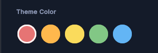
ColorToggleGroup manages a set of ColorToggleButton items as a single-selection group. It supports both tap-to-select and drag-to-select gestures, ensuring that only one color is selected at a time. Selection state is coordinated internally; consumers only need to respond to OnColorSelected.
Typical use cases:
- Full-screen or inline color pickers
- Theme or accent color selectors
- Tag or category color selectors
Properties
| Name | Description | Options |
|---|---|---|
Colors |
Gets or sets the array of colors represented by the group. Changing this value rebuilds all child buttons. | Color[] |
SelectedColor |
Gets the currently selected color. null if nothing is selected. |
Color? (nullable) |
Alignment |
Controls the flex direction of the buttons container. | FlexDirection |
USS Classes
| Class | Description |
|---|---|
colorToggleGroup |
Root element. |
colorToggleGroup__container |
Flex container that holds all ColorToggleButton children. |
Events
| Name | Description | Arguments |
|---|---|---|
OnColorSelected |
Fired when the user selects a color by tap or drag. Not fired when selection changes programmatically via SelectColor(color, propagateEvent: false). |
Color selectedColor |
Methods
| Signature | Description |
|---|---|
DeselectAll() |
Clears the current selection without firing OnColorSelected. |
SelectColor(Color color, bool propagateEvent = true) |
Programmatically selects the button whose color matches. Pass propagateEvent: false to suppress OnColorSelected. |
Usage
Add the control to your scene using:
GameObject -> UI Toolkit -> Extensions -> Color Toggle Group
This creates a UIDocument in the scene (plus a PanelSettings with the default runtime theme, if the project has none) and assigns an editable starter template with demo content, copied to Assets/UI Toolkit Extensions.
A starter template can also be added to an existing document using:
Assets -> Create -> UI Toolkit -> Extensions -> Color Toggle Group Starter
Alternatively, drag the control into a document from the UI Builder Library (Project -> Custom Controls -> UnityUIToolkit.Extensions) or declare it directly in UXML:
<ui:UXML xmlns:ui="UnityEngine.UIElements" xmlns:ext="UnityUIToolkit.Extensions" editor-extension-mode="False">
    <ext:ColorToggleGroup alignment="Row" colors="#FF5A5A,#FFB13D,#4DD08C,#4D9FFF,#B36BFF" />
</ui:UXML>
The shared extensions stylesheet is applied automatically when the control is created in the Editor and in Play Mode, so no manual stylesheet reference is needed while authoring. The starter templates also reference the stylesheet explicitly, which covers player builds; for hand-written UXML or code-first UI in builds, add the stylesheet to your UXML or panel theme.
Using the Control
Inline Color Picker
using UnityEngine;
using UnityEngine.UIElements;
using UnityUIToolkit.Extensions;

public class ThemeSelectorController : MonoBehaviour
{
    [SerializeField] private UIDocument _document;

    private ColorToggleGroup _colorGroup;
    private Color _currentThemeColor = Color.white;

    private void OnEnable()
    {
        var root = _document.rootVisualElement;

        _colorGroup = new ColorToggleGroup();
        _colorGroup.Colors = new[]
        {
            new Color(0.91f, 0.27f, 0.38f),
            new Color(0.25f, 0.56f, 0.96f),
            new Color(0.18f, 0.80f, 0.44f),
            new Color(0.98f, 0.75f, 0.18f),
            new Color(0.60f, 0.20f, 0.80f),
        };
        _colorGroup.Alignment = FlexDirection.Row;

        _colorGroup.OnColorSelected += OnThemeColorPicked;

        root.Q<VisualElement>("colorPickerContainer").Add(_colorGroup);

        // Pre-select the saved theme color without firing the event
        _colorGroup.SelectColor(_currentThemeColor, propagateEvent: false);
    }

    private void OnThemeColorPicked(Color color)
    {
        _currentThemeColor = color;
        Debug.Log($"Theme color changed to {color}");
        // Apply color to your UI here
    }

    private void ResetSelection()
    {
        _colorGroup.DeselectAll();
    }
}
Video Demo
Example Scenes
This control is demonstrated in the following package example:
Credits and Donation
SimonDarksideJ
External links
| UI Toolkit Extensions repository | OpenUPM package |
Demonstrated In
- Profile Editor — An editable profile screen with an avatar, toggles, and colour-tinted option groups.