Elastic List View
Vertical list with iOS-style elastic overscroll and an optional swipe-up load-more trigger.
Contents
1 Overview
4 Events
5 Methods
6 Usage
Overview
ElasticListView is a vertical list with iOS-style elastic overscroll, model-agnostic content, and an optional swipe-up “load more” trigger. It hosts its items in one of two viewports and switches between them automatically:
- When the content overflows, a real
ScrollViewscrolls it — with optional elastic overscroll enabled viaEnableTouchElasticity(). - When the content fits, a manual viewport provides a finger-following bounce with an ease-out snap-back, so even a short list still feels alive instead of inert.
Items are plain VisualElements supplied through AddItem / SetItems (or the generic SetItems<T>(data, factory) overloads), so the control carries no data-model dependency. An optional empty-state message is shown via EmptyStateText. The load-more footer uses a LoadingIcon spinner.
Device-first: the elastic and swipe gestures only behave correctly on a touch device. In the Editor, pointer events are unpredictable and will not reproduce the same swipe/bounce feel.
Typical use cases:
- Mobile feeds and inboxes with pull/elastic scrolling
- Infinite-scroll lists that fetch the next page on swipe-up
- Any list that should bounce gently even when it fits on screen
Properties
| Name | Description | Options |
|---|---|---|
ItemCount |
(Read-only) Number of items currently in the list (excludes the load-more footer). | int |
EmptyStateText |
Message shown when the list is empty. Empty string shows nothing. (UXML: empty-text) |
string |
USS Classes
| Class | Description |
|---|---|
elasticListView |
Root element. |
elasticListView__scrollContainer |
Applied to both the internal ScrollView and the manual viewport. |
elasticListView__content |
The content container that holds the item elements. |
elasticListView__emptyLabel |
The empty-state label. |
elasticListView__loadMoreFooter |
Footer shown beneath the items while a load-more fetch is in flight. |
elasticListView__loadMoreSpinner |
The LoadingIcon spinner inside the load-more footer. |
Events
| Name | Description | Arguments |
|---|---|---|
LoadMoreRequested |
Raised when the user overscrolls past the bottom edge (swipe-up to load more). Fires once per gesture and re-arms on pointer release. Only active between EnableLoadMore() and DisableLoadMore(), and only while no fetch is in flight (i.e. not between BeginLoadMore() and EndLoadMore()). |
none |
Methods
| Signature | Description |
|---|---|
AddItem(VisualElement item) |
Appends a single item. |
AddItems(IEnumerable<VisualElement> items) |
Appends multiple pre-built items. |
AddItems<T>(IReadOnlyList<T> data, Func<T,VisualElement> factory) |
Appends items built from a data list via a factory. |
SetItems(IEnumerable<VisualElement> items) |
Replaces all items and resets the scroll position. |
SetItems<T>(IReadOnlyList<T> data, Func<T,VisualElement> factory) |
Replaces all items, building each via a factory; resets scroll. |
ClearItems() |
Removes all items (keeps the load-more footer if enabled). |
RefreshLayout() |
Recomputes whether to use the scrolling or manual viewport. Called automatically on geometry changes. |
EnableTouchElasticity(float elasticity = 0.12f) |
Enables elastic overscroll on the scrolling viewport with the given elasticity. |
EnableLoadMore() |
Arms the swipe-up “load more” gesture and adds the footer. |
DisableLoadMore() |
Disables and removes the load-more footer/spinner. |
BeginLoadMore() |
Call when you start fetching: shows the footer and plays the spinner. |
EndLoadMore() |
Call when the fetch finishes: hides the footer and stops the spinner. The gesture re-arms automatically. |
Usage
Add the control to your scene using:
GameObject -> UI Toolkit -> Extensions -> Elastic List View
This creates a UIDocument in the scene (plus a PanelSettings with the default runtime theme, if the project has none) and assigns an editable starter template with demo content, copied to Assets/UI Toolkit Extensions.
A starter template can also be added to an existing document using:
Assets -> Create -> UI Toolkit -> Extensions -> Elastic List View Starter
Alternatively, drag the control into a document from the UI Builder Library (Project -> Custom Controls -> UnityUIToolkit.Extensions) or declare it directly in UXML:
<ui:UXML xmlns:ui="UnityEngine.UIElements" xmlns:ext="UnityUIToolkit.Extensions" editor-extension-mode="False">
    <ext:ElasticListView empty-text="No items yet - add some from code." />
</ui:UXML>
The shared extensions stylesheet is applied automatically when the control is created in the Editor and in Play Mode, so no manual stylesheet reference is needed while authoring. The starter templates also reference the stylesheet explicitly, which covers player builds; for hand-written UXML or code-first UI in builds, add the stylesheet to your UXML or panel theme.
Using the Control
A model-driven list with elastic scroll and load-more
using System.Collections.Generic;
using UnityEngine;
using UnityEngine.UIElements;
using UnityUIToolkit.Extensions;

public class FeedController : MonoBehaviour
{
    [SerializeField] private UIDocument _document;

    private ElasticListView _list;
    private int _page;

    private void OnEnable()
    {
        _list = _document.rootVisualElement.Q<ElasticListView>("feed");
        _list.EmptyStateText = "Nothing here yet";
        _list.EnableTouchElasticity(0.12f);
        _list.EnableLoadMore();

        _list.LoadMoreRequested += FetchNextPage;

        // Build rows from a data model via a factory — no model dependency in the control.
        _list.SetItems(FetchPage(0), data => new Label(data));
    }

    private void FetchNextPage()
    {
        _list.BeginLoadMore();
        // …kick off async fetch; when it returns:
        _list.AddItems(FetchPage(++_page), data => new Label(data));
        _list.EndLoadMore();
    }

    private List<string> FetchPage(int page) =>
        new() { $"Item {page}.1", $"Item {page}.2", $"Item {page}.3" };
}
Video Demo
Example Scenes
This control is demonstrated in the following package example:
Credits and Donation
SimonDarksideJ
External links
| UI Toolkit Extensions repository | OpenUPM package |
Demonstrated In
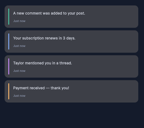
- Notification List — A scrollable notification feed with unread-count badges and an elastic, swipe-to-load-more list.