UIToolkit Extensions
25 modern controls and manipulators for Unity's UI Toolkit framework. Built for runtime UI — ready for production.
Installation
Install via OpenUPM
openupm add com.unity.uitoolkitextensionsOr add the scoped registry manually in Edit → Project Settings → Package Manager:
Name: package.openupm.com
URL: https://package.openupm.com
Scope: com.unity.uitoolkitextensionsInstall via Git URL
Open the Package Manager (Window → Package Manager), click + → Add package from git URL and paste:
https://github.com/Unity-UI-Extensions/com.unity.uitoolkitextensions.gitManual / Embedded Package
- Download the latest release from the Releases page
- Extract and place the folder in your project's
Packages/directory - Unity will automatically detect and import the package
All Controls
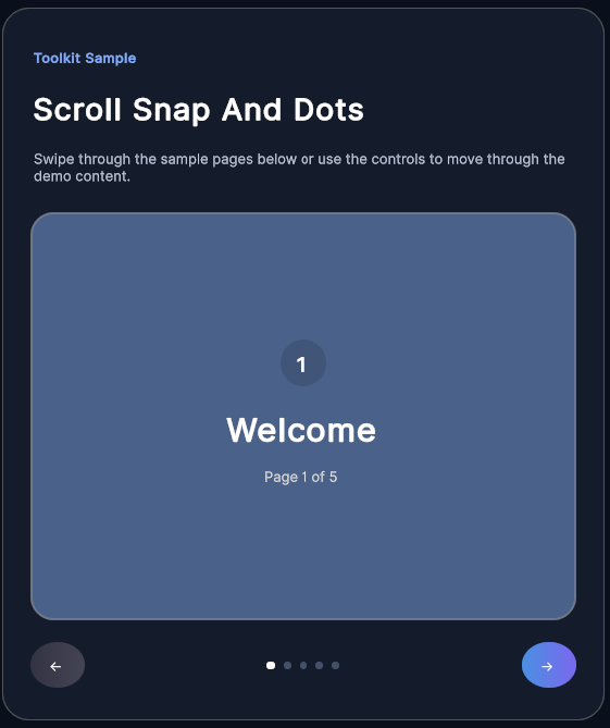
Scroll Snap
NavigationSwipe/drag paged scroll container that snaps to discrete pages by index.
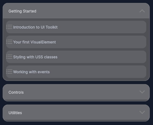
Collapsible Section
NavigationAnimated expand/collapse section with header toggle and content container.

Quadrant Stepper
NavigationFour-directional step selector displayed as an overlay compass widget.

Screen Header
NavigationConfigurable top app-bar with title, notch spacer, and up to four edge action buttons.
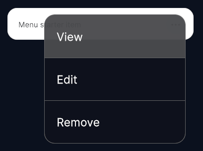
Dropdown Menu
NavigationAnchored overlay action menu with large tappable rows and backdrop-tap dismiss.
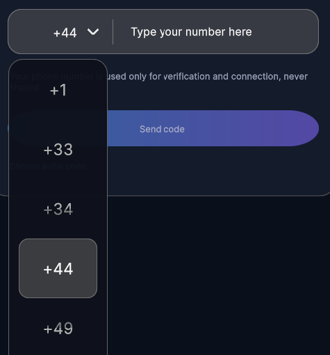
Dropdown
FormsWheel-style dropdown picker that opens a touch-friendly modal list for single-value selection.
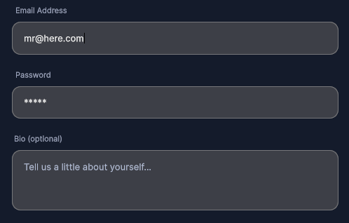
Pill Input Field
FormsRounded pill-shaped input field with floating label and validation state.
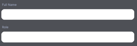
Rounded Input Field
FormsCard-style text input with rounded corners and focus/error colour states.

Pill Selector
FormsRow of pill-shaped radio buttons for exclusive single-option selection.

Toggle Button
FormsFlat toggle switch with animated indicator and on/off label support.
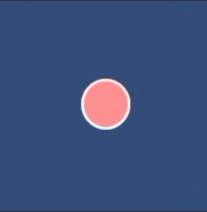
Color Toggle Button
FormsToggle button that tints itself with a configurable accent colour when active.
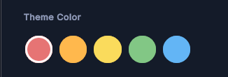
Color Toggle Group
FormsHorizontally scrollable row of colour-tinted toggle buttons for multi-select.
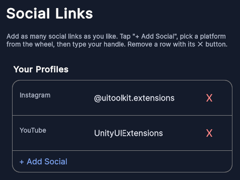
Social Link Container
FormsEditable list of platform-labelled social link fields with add/remove and a platform picker.
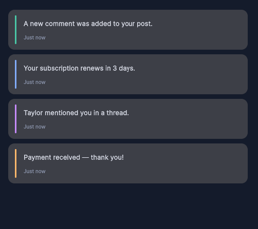
Elastic List View
LayoutVertical list with iOS-style elastic overscroll and an optional swipe-up load-more trigger.

Step Progress Bar
FeedbackSegmented progress bar with labelled milestone steps and fill animation.

Page Dot Indicator
FeedbackAnimated pagination dots that reflect the current page of a scroll view.
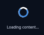
Loading Icon
FeedbackAnimated spinner/loading indicator with configurable speed and colour.

Toast Swipe Dismiss Manipulator
FeedbackGesture manipulator that allows swiping a toast/notification to dismiss it.
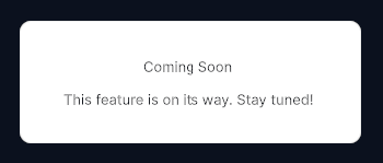
Coming Soon Message
FeedbackPlaceholder panel displaying a styled 'coming soon' message with icon.

Notification Badge
FeedbackSmall rounded unread-count badge that auto-hides at zero and clamps to 99+.

Pill Button
PrimitivesPrimary CTA button in a rounded pill shape with press flash animation.

Circular Image Button
PrimitivesCircular avatar/icon button with mask, border, and selected-state styling.
Icon Label Button
PrimitivesHorizontal row button combining a left-side icon with label and subtitle text.
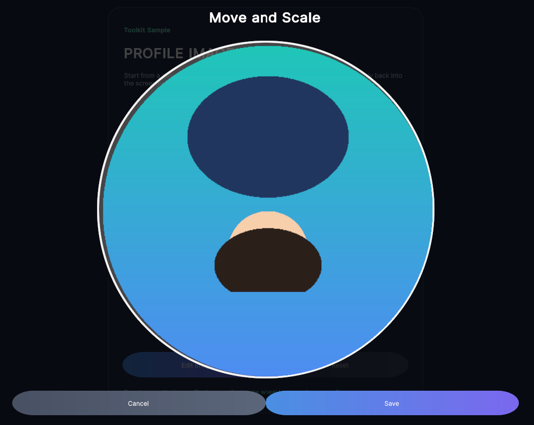
Image Crop Overlay
UtilitiesFull-screen modal image cropper with drag-to-pan, pinch-to-zoom, and configurable square export.
Grayscale Image
UtilitiesShader-based Image element that renders in greyscale with adjustable intensity.