Range Slider
Dual-handle slider for selecting a minimum/maximum value range.
Range Slider
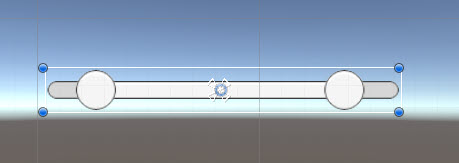
A UI Slider control with a min (low) and max (high) value
Contents
1 Overview
3 Methods
4 Usage
6 See also
Overview
A Ui control which allows you to have two slider values in a single control
Properties
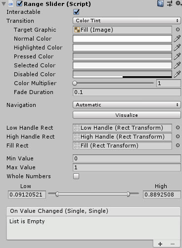
The properties of the Range Slider control are as follows:
| Property | Description |
|---|---|
| Low Handle Rect | The RectTransform of the Low value handle graphic |
| High Handle Rect | The RectTransform of the High value handle graphic |
| Fill Rect | RectTramsform of the fill for the slider (between min and max) |
| Min Value | The minimum / lower value for the control |
| Max Value | The maximum / higher value for the control |
| Whole Numbers | Should the control use whole or precision numbers |
| On Value Changed (event) | The Event fires when the range is changed |
Methods
This component does not expose public methods beyond inherited behaviour.
Usage
To enable the Range Slider component, simply add a new UI Object using:
“GameObject -> UI -> Extensions -> Sliders -> Range Slider”
Alternatively, add the component to an existing GameObject using:
“Add Component -> UI -> Extensions -> Sliders -> Range Slider”
Video Demo
See also
None
Credits and Donation
- Ben MacKinnon (@Dover8)