Flow Layout Group
Automatically wraps child elements into rows or columns like CSS flexbox.
FlowLayoutGroup
A more rugged grid style layout group
Contents
1 Overview
3 Usage
5 See also
Overview
A more rugged grid style layout group
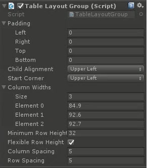
Properties
The properties of the Box Slider control are as follows:
| Property | Description |
|---|---|
| Handle Rect | The Rect Transform of the child handle, position used to derive values for control |
| Min Value | The minimum value for the sliders |
| Max Value | The maximum value for the sliders |
| Whole Numbers | Only use whole numbers instead of floats |
| Value X | The X value of the slider |
| Value Y | The Y value of the slider |
| On Value Changed (event) | The Event fired when the handle within the box slider is changed |
Inherited from Slider
- Interactable
- Transition
- Navigation
Methods
This component does not expose public methods beyond inherited behaviour.
Usage
Like with other Layout controls, simply add this to the parent RectTransform for a collection of child elements through the Add Component menu as follows:
“Add Component -> Layout -> Extensions -> Flow Layout Group”
Video Demo

See also
Credits and Donation
Simie
External links
Demonstrated In
- Flow Layout Group — Wraps child elements into rows or columns, like CSS flexbox.