DropDown List
Styleable dropdown list with animated open/close and custom item rendering.
DropDownList
A basic drop down list with text and image support
Contents
1 Overview
3 Methods
4 Usage
6 See also
Overview
A more advanced Combobox control with additional support for images and other items in the selection pane
Properties
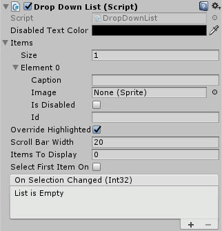
The properties of the Drop Down List control are as follows:
| Property | Description |
|---|---|
| Disabled Text Color | Color of the Autocomplete field when the control is disabled. |
| Available Options | Array of child options options for the dropdown/selection. Each child is configured within the array below: |
| -Caption | Text for the Child item. |
| -Image | Image displayed next to child item. |
| -Is Disabled | Is this child item disabled by default. |
| -Id | Unique identity of the drop down item. |
| Is Active | Can the autocomplete combo box be activated by the user (dropped down) or is it disabled? |
| Override Highlighted | Should the normal highlight behavior of the control be ignored. |
| Scroll Bar Width | The width of the scrollbar when displayed. |
| Items To Display | Number of child items to display when opened. *Note default 0 shows NO items. |
| Dropdown Offset | Offset height for where the dropdown list should appear. |
| Display Panel Above | Should the dropdown panel appear above the control instead of below? |
| Select First Item On Start | Should the first item be auto selected on start? |
| Select Index Item on Start | Which item should be selected on start. (Select First Item on Start will override this option) |
| On Selection Changed (event) | The Event fired when the user selects an option or loses focus |
| On Control Disabled (event) | The Event fired when the control is disabled through code. |
When managing the control programmatically, make sure you use the following functions to manage the ComboBox contents. Do NOT update the ‘AvailableOptions’ list directly
Methods
| Method | Arguments | Description |
|---|---|---|
| AddItem | DropDownListItem | Adds a new item to the drop down list and rebuilds the display |
| AddItem | String | Adds a new item to the drop down list and rebuilds the display |
| AddItem | Sprite | Adds a new item to the drop down list and rebuilds the display |
| RemoveItem | DropDownListItem | Removes an item from the drop down list and rebuilds the display |
| RemoveItem | String | Removes an item from the drop down list and rebuilds the display |
| RemoveItem | Sprite | Removes an item from the drop down list and rebuilds the display |
| RefreshItems | Array of supported items (DropDownListItem, String or Sprite) | Clears the current list and rebuilds a new list with the provided items |
| SelectItemIndex | int | Sets the currently selected item in the list |
| ResetItems | N/A | Clears all current options |
Usage
Add the DropDownList control to your scene using:
“GameObject -> UI -> Extensions -> ComboBox -> DropDownList”
Alternatively, add the component to an existing GameObject using:
“Add Component -> UI -> Extensions -> ComboBox -> Dropdown List”
Then simply add drop down elements to the Items property. Additionally, Images and other items may be added to enhance the drop down items
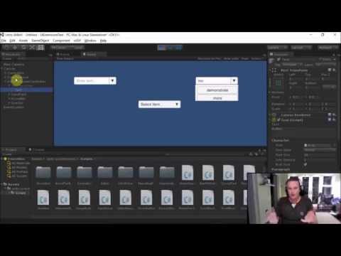
Video Demo
See also
Credits and Donation
Perchik
External links
Demonstrated In
- ComboBox & Dropdowns — Compares the ComboBox, AutoComplete ComboBox, and DropDown List selection controls side by side.