Unity UI Extensions
Segmented Control
A segmented control, like those found on iOS. It’s two or more buttons side by side, where only one of them is selectable at a time

Contents
1 Overview
3 Methods
4 Usage
6 See also
Overview
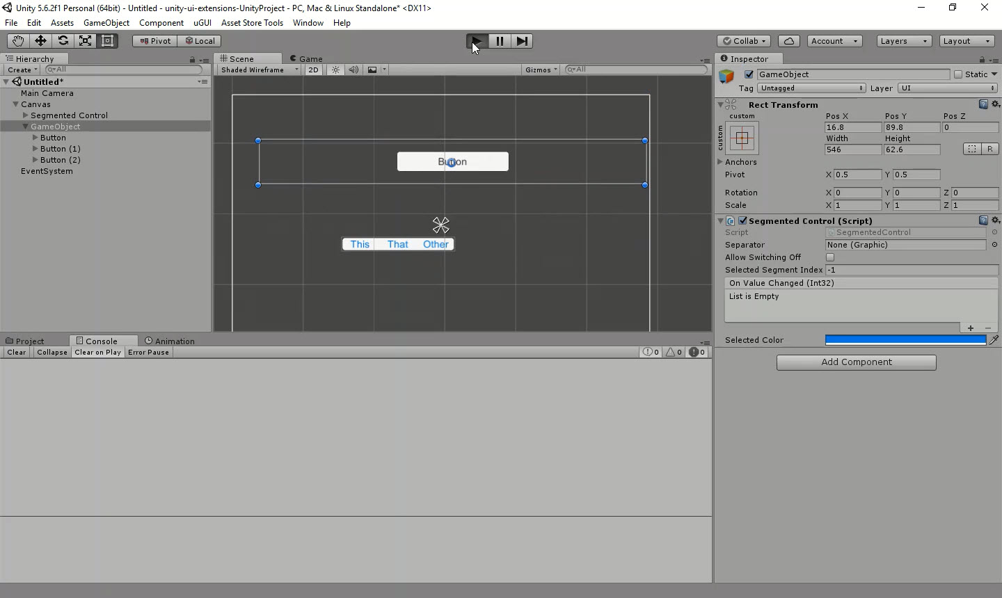
The Segmented Control offers a button alignment capability along with specific highlights that emulates the iOS version of a segmented button. The control presented itself as a single image with multiple options, where only one can be selected.

It allows you to set whether buttons can be turned on/off, or only one selected at a time, as well as setting the default select and the colour the button is highlighted with when clicked..
Like the Stepper Control, you can also specify a Separator image attached to a GO to place between the buttons.
Properties
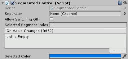
The properties of the Segmented Control are as follows:
| Property | Description |
|---|---|
| Separator | A graphic based UI GO, which will serve as the image that separates each button. *Note, you should disable the GO used for the separator or use a prefab to avoid dirtying the scene. |
| Allow Switching Off | When set, buttons can be clicked but not unselected, only selecting a new option will clear the selection |
| Selected Segment Index | Zero based index which chooses the selected default. This defaults to -1 which denotes no option selected |
| Selected Color | The highlighted color of the button when an option is selected |
| On Value Changed (event) | The Event fired when the selection within the control changes, passing the index of the selected button |
Methods
This component does not expose public methods beyond inherited behaviour.
Usage
Simply add the default Segmented Control to the scene using:
“GameObject -> UI -> Extensions -> Controls -> Segmented Control”
It is also available as a Game Component menu:
“Add Component -> UI -> Extensions -> Segmented Control -> Segmented Control”
However, you will need to manually add buttons as children to the GameObject for the options.
Video Demo
Click to play
See also
Credits and Donation
Credit David Gileadi
External links
Sourced from - https://bitbucket.org/UnityUIExtensions/unity-ui-extensions/pull-requests/12/segmented-control/diff
