Unity UI Extensions
Radial Slider
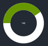
A radial slider which fills in a circular pattern
Contents
1 Overview
3 Methods
4 Usage
6 See also
Overview
The Radial Slider is a graphical fill control utilizing Unity’s native Image fill capabilities.
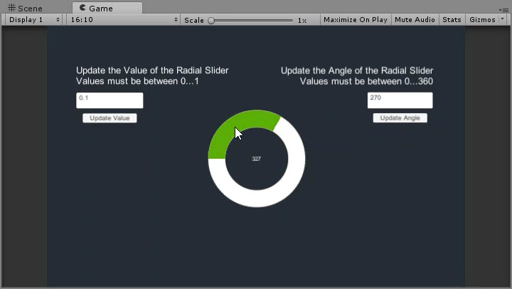
It allows you to define a color range for the slider in a circular pattern beginning from the Left hand side (rotate the control for other starting points.) It also has built in Lerping capability and can be used to:
- Move value to Click
- Move value to drag
- Click to Lerp
For this first release, the control is fixed to start at zero. may improve the control (if needed) to support a different start. If you need a different start for now, set the Value/Angle on Start/Awake and NOT in the editor.
Properties
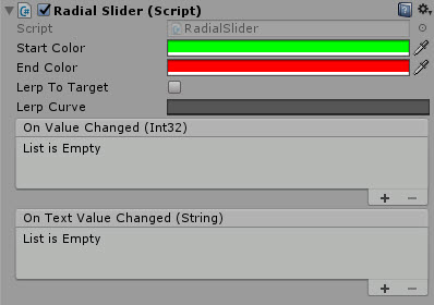
The properties of the Radial Slider control are as follows:
| Property | Description |
|---|---|
| Start Color | The Gradient color for the beginning of the radius. |
| End Color | The Gradient color for the end of the radius. |
| Lerp To Target | Should the control jump to it’s intended position or Lerp. *Note, Dragging is only supported when this is off |
| Lerp Curve | Use a standard Lerp or a gradient curve using the Unity native Curve control. |
| On Value Changed (event) | The Event fired when the value of the slider is changed, outputs an Integer value |
| On Text Value Changed (event) | The Event fired when the value of the slider is changed, outputs a Text value |
Methods
This component does not expose public methods beyond inherited behaviour.
Usage
Simply add the default Radial Slider to the scene using:
“GameObject -> UI -> Extensions -> Sliders -> Radial Slider”
Alternatively, add the component to an existing GameObject using:
“Add Component -> UI -> Extensions -> Sliders -> Radial Slider”
Video Demo
Click to play
See also
- tbc
Credits and Donation
Credit mgear
External links
Sourced from - https://forum.unity3d.com/threads/radial-slider-circle-slider.326392/#post-3143582