Unity UI Extensions
Card UI
A range of controls to provide a Card based interface, this includes several capabilities and features to manipulate the cards based on requirements, including:
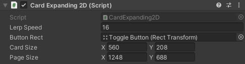
- 2D Expanding cards
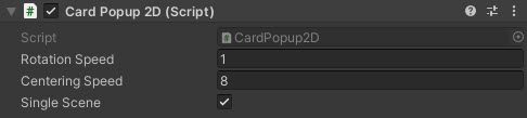
- 2D Popup, including falling cards
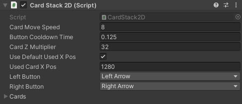
- 2D card stacks
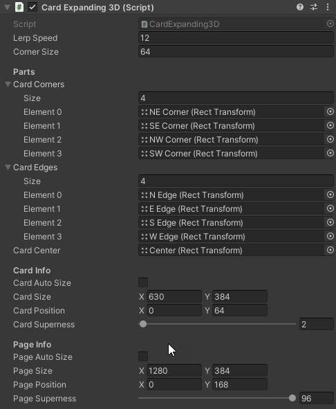
- 3D Expanding cards and Superelipses
Contents
1 Overview
3 Methods
4 Usage
6 See also
Overview
The range of Card UI controls give you several options for creating card like UI elements for your project.
- 2D Expanding Card - A clickable/expandable card layout.
- 2D Popup - Physics enabled falling cards.
- 2D Stacked cards - A depth orientated controller for displaying cards stacked on top of each other.
- 3D Cards - Custom panel meshes with rounded corners for advanced effect.
| 2D Card Expanding | 2D Popup Cards |
|---|---|
 |
 |
| 2D Stacked Cards | 3D Expanding Cards |
|---|---|
 |
 |
Properties
The Card UI suite includes several prefabs and behaviours. Key shared inspector settings include:
| Property | Description |
|---|---|
| Card Prefab(s) | Prefabs for the chosen card style (2D popup, 2D stacked, 3D superellipse, etc.). |
| Animation Duration | Time (seconds) for expand/collapse or popup animations. |
| Spacing / Stack Offset | Gap or depth offset between cards in a stack. |
| Max Visible / Pool Size | How many cards are kept active/pooled for performance. |
| Use Physics | Toggles physics-based motion for popup/falling cards. |
| Corner / Roundness | Rounding amount for 3D/superellipse card corners. |
| On Card Selected (event) | Invoked when a card is selected/expanded (per prefab where exposed). |
| On Card Closed (event) | Invoked when a card collapses or returns to stack (per prefab where exposed). |
Methods
This component does not expose public methods beyond inherited behaviour.
Usage
For fuller demonstration of the setup of the Card UI controls, checkout the CardUI scenes in the Unity UI Extensions Examples,
Video Demo

See also
N/A
Credits and Donation
Credit ryanslikesocool
External links
Sourced from - https://github.com/ryanslikesocool/Unity-Card-UI