Unity UI Extensions
AutoComplete ComboBox
A text combobox with autocomplete selection
Contents
1 Overview
3 Methods
4 Usage
6 See also
Overview
A specialised text field that allows a vocabulary to be added to guide or restrict entry.
Properties
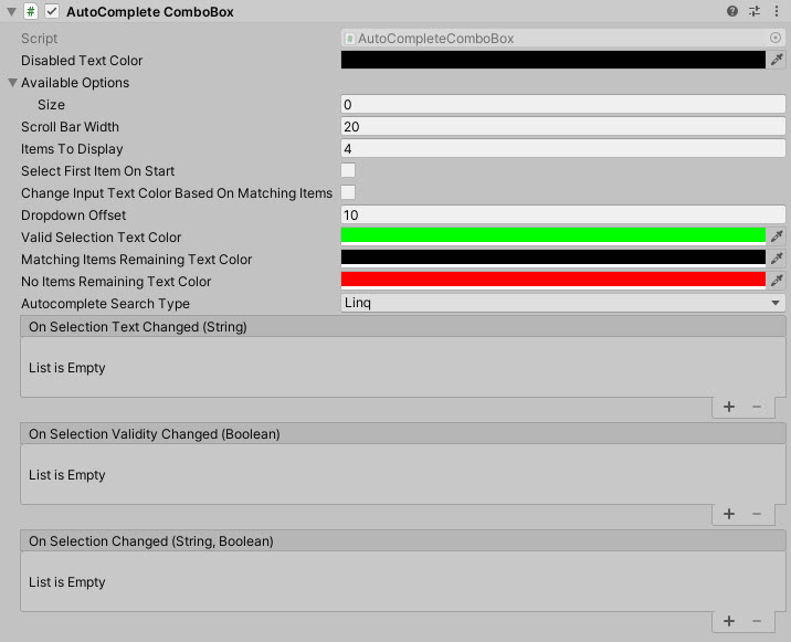
The properties of the AutoComplete Combobox control are as follows:
| Property | Description |
|---|---|
| Available Options | Array of text based options for the dropdown/selection. |
| Is Active | Can the autocomplete combo box be activated by the user (dropped down) or is it disabled? |
| Scroll Bar Width | The width of the scrollbar when displayed. |
| Items To Display | Number of child items to display when opened. *Note default 0 shows NO items. |
| Change Input Text based on Matching items | Apply the below colors to the AutoComplete field based on user typing. |
| Valid Selection Text Color | Color of the AutoComplete text if the full text appears in the list of options. |
| Matching Items Remaining Text Color | Intermediate color of text when options contain the text entered. |
| No Items Remaining Text Color | Text Color when the text entered does not match anything in the list. |
| Autocomplete Search Type | Selects the search method for which to validate the panel items. Values Linq, Array Sort. Choose whichever performs best for your project. |
| Dropdown Offset | Offset height for the drop down window, to give enough space for items. |
| Display Panel Above | Should the dropdown panel appear above the control instead of below? |
| Select First Item On Start | Should the first item be auto selected on start? |
| Select Index Item on Start | Which item should be selected on start. (Select First Item on Start will override this option) |
| On Selection Text Changed (event) | The Event fired when the user is typing. |
| On Selection Validity Changed (event) | The Event fired when the text the user enters matches a selection. |
| On Selection Changed (event) | The Event fired when the user selects an option or loses focus. |
| On Item Selected (event) | The Event fires when an item is selected from the drop down, or the box closes (with a valid item). |
| On Control Disabled (event) | The Event fired when the control is disabled through code. |
When managing the control programmatically, make sure you use the following functions to manage the ComboBox contents. Do NOT update the ‘AvailableOptions’ list directly
Methods
| Method | Arguments | Description |
|---|---|---|
| AddItem | String | Adds a single item to the list |
| RemoveItem | String | Removes a single item from the list |
| SelectItemIndex | int | Sets the currently selected item in the list |
| SetAvailableOptions | List of String | Clears the current options and replaces with new list (array or List) |
| SetAvailableOptions | Array of String | Clears the current options and replaces with new list (array or List) |
| ResetItems | N/A | Clears all current options |
Usage
Add the AutoComplete ComboBox control to your scene using:
“GameObject -> UI -> Extensions -> ComboBox -> AutoComplete ComboBox”
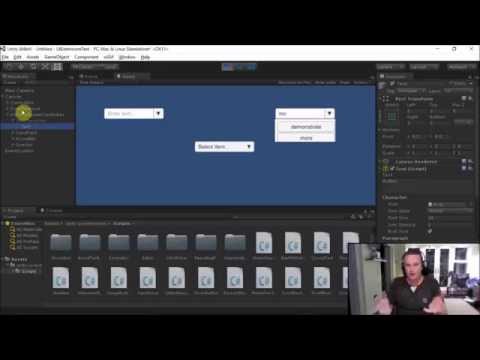
Video Demo
See also
Credits and Donation
Perchik