Unity UI Extensions
Accordion
An Accordion style control with animated segments.
Contents
1 Overview
3 Methods
4 Usage
6 See also
Overview
A menu style control with pop-out sub elements like a hover bar.
Properties
The Accordion setup uses two components:
| Property | Description |
|---|---|
| Transition | Tween type used when expanding/collapsing elements. |
| Transition Duration | Time (seconds) for expand/collapse. |
| Allow Multiple | If true, multiple accordion elements can stay open simultaneously. |
| Toggle On | If true, clicking an open element will close it. |
| Keep Active On Hide | Leave element content active when collapsed (keeps layout space). |
| On Value Changed (event) | Event fired when the open element changes. |
Methods
This component does not expose public methods beyond inherited behaviour.
Usage
Add the accordion control to your scene using:
GameObject -> UI -> Extensions -> Accordion Group
Additional child elements can be added using:
GameObject -> UI -> Extensions -> Accordion Element
To get started with your first accordion, simply follow these steps:
-
Add an Accordion Group to your UI scene using the menu command above.
-
Select the “Accordion Group” and add a new Accordion Element by Right-clicking and selecting “UI -> Extensions -> Accordion Element”
-
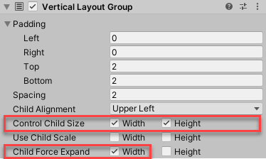
Add a Vertical Layout Group to your new Accordion Element and enabling Control Child Size width and height to True.
Ensure you only set Child Force Expand Width to True (Expand Height should be False):
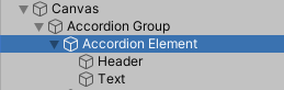
- Design your Accordion element with a Header and Content, for example, two child Text objects as shown below:
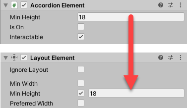
- Add a Layout Element to your Header and set the Min Height to the same as the size used in the Accordion Element:
Feel free to duplicate and update your Accordion Elements to fill up your group.
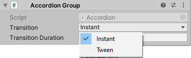
The Group can be set to Expand Instantly or use a Tween function to animate the entrance of each Accordion Element child text by setting the Transition on the group as shown below.
Currently the control is only designed for Vertical Transition of vertically stacked items. For additional layouts, please log an issue on the site with your requirements.
Video Demo
See also
Some tips are here: Accordion Type Layout including how to collapse nested child elements so they no longer appear.
Credits and Donation
ChoMPHi